Clarify - ai powered financial literacy app
Foundations, core flows and design system
(self-initated)

Overview
& Scope
What is Clarify?
Clarify is an AI-powered financial literacy app designed to make learning about money feel more approachable. It helps users explore financial topics at their own pace, build a personal financial profile, and make more informed decisions with greater confidence.
My work
I started this project from scratch with the goal of creating a strong foundation for a mobile app that could grow into a fully production-ready experience. This included defining the initial product assumptions and goals, mapping high-level user flows, shaping the visual direction, building a design system, and designing several core user journeys.
Core features

Chatbot with integrated caculators
Receive real financial calculations directly in chat. Tweak the data to get the answers you need.


Foundations
The project began with research into the broader landscape of financial learning. Most users today consume financial content through social media, where advice can often be misleading or oversimplified. Another popular source is traditional chatbots, but their tendency to hallucinate, especially when it comes to calculations, introduces its own set of problems.
To address this, Clarify would need to rely on a curated assortment of verified sources to answer most user questions, while handling selected calculations through pre-built calculators. From these insights, I defined three core goals: make financial learning feel approachable, let users focus on topics relevant to their situation, and create a structure that supports better financial decisions over time.
Additionally I worked on an early user flow in this phase to define the structure of the experience before moving into design explorations. These goals and early explorations shaped the product assumptions and set the direction for the work that followed.
1
Goals and research
Research into financial learning enviroment and apps with similar patterns defined how the app should work.


Clarify
design system
I created Clarify design system as a scalable base for the app. With a structured token setup and components built around atomic design principles, it supports a mobile interface that feels consistent, intuitive, and easy to extend as the product grows. It also helped establish clear design decisions and created a strong foundation for building new flows in a more efficient way.
Libraries
Clarify Figma design system consists of 3 libraries:
Component library - components and static assets,
Styles & variables - color and typography tokens,
Icon library - adapted from Feather Icons.


Components
Components are bulit to scale with a modular library structure that allows for rapid design and iteration without detaching components.

Token setup
I set up the design tokens to define the app’s color, spacing, and type foundations from the start. This structure made it easier to keep core elements consistent and established a clear base for building the interface in a more organized way, while keeping the system open for additions like dark mode, brands or interface scaling.

Core Journeys
Highlight: Update financial data
For this project, I designed several user flows, including the Edit My financial data flow. In this section, I’m highlighting several key screens from that journey, where users can update their financial information through a dedicated menu to get more relevant and accurate results from Clarify chat.

Home screen

Edit financial data main screen

Editing Avg. expenses

Editing Item: Gym membership - initial view
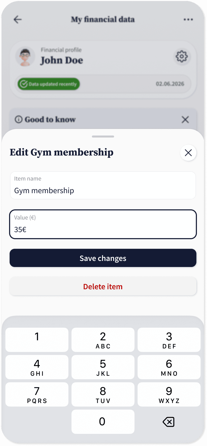
Editing Item: Gym membership - value changed

5a. Delete item - alternative action
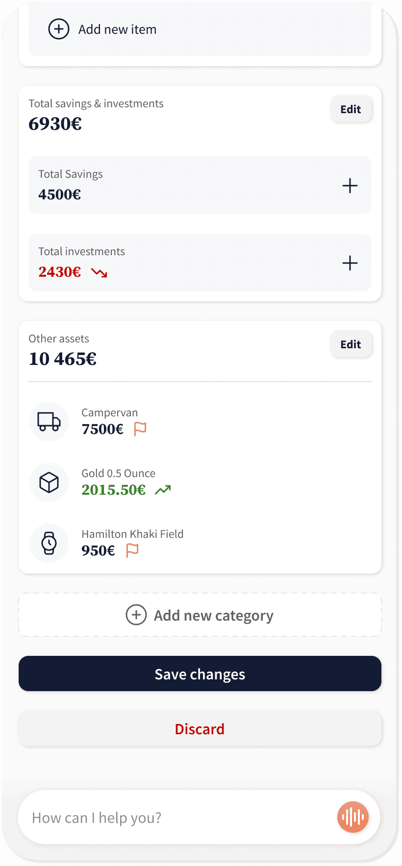
Changes ready to be saved

Data saved - flow end


